Flip Box Shortcode

Animated flip boxes are simply awesome. We’ve never met anyone who doesn’t love these bad boys. They are great for grabbing the users attention and adding some interaction with your content. Avada’s flip boxes have fully customizable content on the front and back side. They are fully integrated with the Font Awesome icon set and icon options like spin, rotate, flip. You can put a title on the front and backside, add buttons to your content and the box height will extend based on the amount of content you use. Customize the border size, border radius and have full control over the front and backside colors. Oh yeah, and you can animate them with CSS3 goodness. These are an Avada favorite, and for good reason.

Indhold:

Siden er en bred guide til blåvand

Indhold:

Blåvandguiden giver dig overblik

Indhold:

Visitwestdenmark er en allround side, der dækker Varde kommunes turistdestinationer.

Column Sizes

Flip boxes have their own column option to set which allows the content box to fill the column width from 1-6 columns. They can also be used inside of our regular column shortcode to control their placement on the page.

Column Sizes

Avada's column options are integrated into the flip boxes, making it easy to set 1-6 columns. Content boxes will always resize accordingly. It's a beautiful thing.

Perfect For All Sizes

No matter the size of your screen or device, your site will look fantastic.

Blåvand på nettet.

Disse tre websider giver hver for sig og tilsammen et rigtigt godt overblik i de muligheder, Blåvand og omegn byder på.
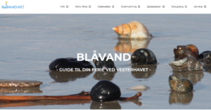
Blaavand.net

Blaavand.net

Blåvand-Ho Erhverv

Blåvand-Ho Erhverv

Visitwestdenmark

se mere om turismen i varde

Icon Haven

Font Awesome Icons are tightly integrate into the flip boxes along with multiple options; icon color, circle color and border, circle show or hide, icon flip, rotate, spin and animate.

Awesome

Font Awesome Icon integration is perfect.

Control Your Icons

Change just about every aspect of the icon and circle that contains it. Take Control.

Icons

Font Awesome Icon integration is perfect.

Control Your Colors

Change just about every aspect of the icon and circle that contains it. Take Control.

Need Images? Check!

Instead of using an icon, you can choose to use an image that will show up in the same area as the icon. The settings allow you to specify the exact image size so it displays perfectly in the box. Using an image instead of an icon opens up a whole new look for the flip boxes and gives additional creative uses.

blaavand.net

Images can be used in place of icons.

Indhold

Læs mere her

Images Love Flip Boxes

Images can be used in place of icons.

A Whole New Look

Instead of using icons, you can choose to use images. This opens up a whole new look for the flip boxes and gives you more creative freedom in creating layouts.

Border Control

Flip boxes allow you to use borders and set the border width, color and radius. You can even set the border properties individually per box to make one box stand out from the others with featured content. Take control of your borders.

Indhold:

Blaavand.net er en guide

Indhold:

Blåvand-Ho Erhverv

Indhold:

Visitwestdenmark er

Complete Set of Options

Every option and description included with the alert shortcode is listed below.

  • columns – Can be one of these values: 1, 2, 3, 4, 5, or 6. Sets the number of columns per row.
  • title_front -The custom title text for the front side of the flip box.
  • title_back – The custom title text for the back side of the flip box.
  • text_front – The custom body text for the front side of the flip box.
  • border_color – Accepts a hexcode ( #000000 ). Sets the border’s color. Leave blank for Theme Option selection.
  • border_radius – Accepts a pixel value that sets the border’s radius. For example, 4px. Leave blank for Theme Option selection.
  • border_size – Accepts a pixel value that sets the border’s size. For example, 4px. Leave blank for Theme Option selection.
  • background_color_front – Accepts a hexcode ( #000000 ). Sets the front side’s background color. Leave blank for Theme Option selection.
  • title_front_color – Accepts a hexcode ( #000000 ). Sets the front side’s title color. Leave blank for Theme Option selection.
  • text_front_color – Accepts a hexcode ( #000000 ). Sets the front side’s body text color. Leave blank for Theme Option selection.
  • background_color_back – Accepts a hexcode ( #000000 ). Sets the back side’s background color. Leave blank for Theme Option selection.
  • title_back_color – Accepts a hexcode ( #000000 ). Sets the back side’s title color. Leave blank for Theme Option selection.
  • text_back_color – Accepts a hexcode ( #000000 ). Sets the back side’s body text color. Leave blank for Theme Option selection.
  • icon – A font awesome icon value. For example, fa-glass.
  • icon_color – Accepts a hexcode ( #000000 ). Sets the icon’s color. Leave blank for Theme Option selection.
  • circle – Can be one of these values: yes, or no. Sets if the icon is circular or not.
  • circle_color – Accepts a hexcode ( #000000 ). Sets the icon’s background color. Leave blank for Theme Option selection.
  • circle_border_color – Accepts a hexcode ( #000000 ). Sets the icon’s border color. Leave blank for Theme Option selection.
  • icon_flip – Can be one of these values: none, horizontal, or vertical. Sets the direction where the icon will flip.
  • icon_rotate – Can be one of these values: none, 90, 180, or 270. Sets the angle of the icon’s rotation.
  • icon_spin – Can be one of these values: yes, or no. This will enable or disable the icon’s spinning feature.
  • image – The URL path of your custom icon image, starting with http:// and usually ending on .jpg, .png or .gif. Make sure there is no “icon=” value.
  • image_width – This parameter is for custom icon images. Accepts a numerical value to set a custom width in pixels. For example, 35.
  • image_height – This parameter is for custom icon images. Accepts a numerical value to set a custom height in pixels. For example, 35.
  • animation_type – Can be one of these values: none, bounce, fade, flash, shake, or slide. Sets the animation to use on the icon inside the box only.
  • animation_direction – Can be one of these values: down, right, left, or up. Sets the incoming direction for the animation of the icon inside the box only.
  • animation_speed – Accepts a numerical value from .1, which is the slowest, to 1, which is the fastest. This is only for the icon inside the box.
  • class – Add a custom class to the wrapping HTML element for further css customization.
  • id – Add a custom id to the wrapping HTML element for further css customization.

Join The 100,000+ Satisfied Avada Users!